

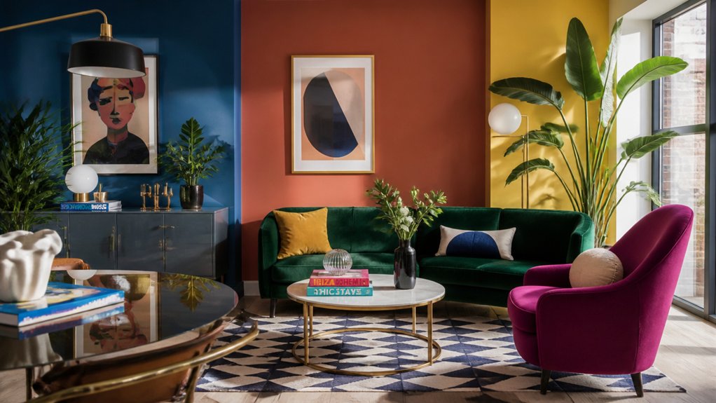
Nearly 6 in 10 UK decorators say they’re choosing stronger paint shades than they did two years ago, and 2026 is pushing that shift further. You’re seeing electric cobalt, lacquered emerald, and paprika red move from accents to full walls, cabinetry, and even ceilings. Pair them with aubergine or oat and you get a more designer-led contrast without feeling chaotic. The real question is where you place the boldest hit first…
Key Takeaways
- High-saturation shades like electric cobalt, lacquered emerald, and paprika red are shifting from feature walls to full-room schemes.
- Inky aubergine and ultramarine are replacing safer navies, delivering deeper, more modern drama across UK interiors.
- “Quiet pop” pairings—ink navy with butter yellow, or aubergine with putty—balance bold colour with everyday liveability.
- Colour-drenching trims, doors, and radiators to match walls creates a premium, larger-room effect, especially in matte or eggshell finishes.
- Kitchens are adopting bold cabinets and islands in navy, forest green, oxblood, or teal, paired with warm metals and pale worktops.
Which Bold Paint Colours Are Trending in the UK for 2026?
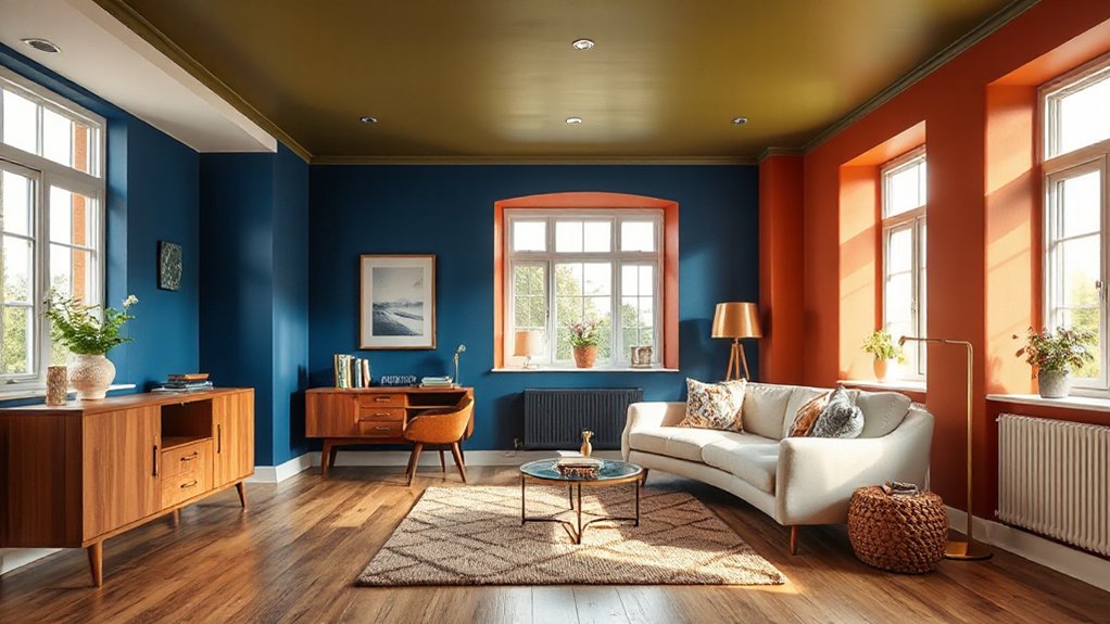
As UK paint brands and interior forecasters push bolder palettes for 2026, you’ll see high-saturation shades moving from “statement wall” territory into whole-room schemes. You’ll spot electric cobalt, lacquered emerald, and punchy paprika red climbing search volume and retailer “saved” lists.
While inky aubergine and ultramarine replace safer navies.
You’ll also see warmer brights gaining share: marigold, coral, and high-chroma terracotta that read optimistic under LED lighting. For cooler homes, you’ll lean into glacier teal and mineral green that hold depth in grey daylight.
If you still want Bold accent walls, you’ll choose cleaner, less-muted pigments for sharper contrast. You’ll then layer trims and alcoves, or complement paint with Vibrant wallpaper patterns in halls and WCs.
What Bold Colour Pairings Look Designer-Led in 2026?
Although bold paint is everywhere in 2026, the most designer-led rooms in UK homes pair two high-impact hues with clear contrast in temperature and depth—think saturated jewel tones anchored by a warm earth note or a crisp off-neutral.
You’ll see oxblood with clay, cobalt with oat, and emerald with tobacco, because bold colour psychology says warmth boosts comfort while cool tones signal clarity and space.
To make it look intentional, you’ll use colour pairing techniques designers track in trend reports: 70/30 dominance, shared undertones, and value spacing (one deep, one mid-light).
You’ll also lean into “quiet pop” pairings—ink navy plus butter yellow, aubergine plus putty—since UK search data keeps rising for high-contrast yet liveable palettes in 2026.
How Do You Use Bold Colour on Walls and Ceilings?
Bold pairings look most premium in 2026 when you scale them onto planes, not just palettes—UK decorators are taking colour off the feature wall and onto ceilings, alcoves, and full-height runs to control proportion and mood.
Start by mapping sightlines: if your room’s longest view is 4–6m, run one saturated colour the full height on that axis to visually “pull” depth forward.
Use wall texture to soften intensity: matte or mineral finishes reduce glare and read richer under LED lighting.
For low ceilings, add ceiling accents in a 10–20% lighter tint than the wall to lift height without losing drama.
In open-plan zones, paint the ceiling over dining or desk areas to create a colour “canopy” that signals function and helps acoustics.
How Can You Colour-Drench Trims and Woodwork?
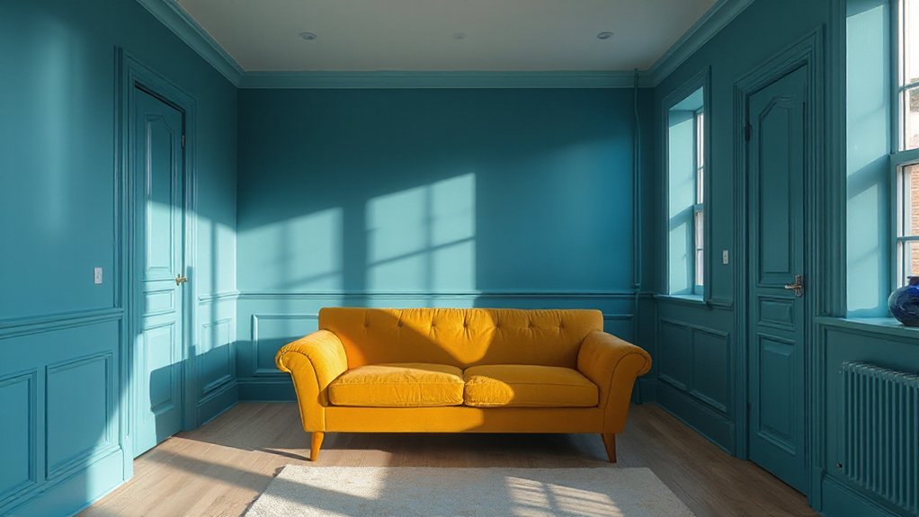
When you colour-drench trims and woodwork in 2026, you’ll see the cleanest, most expensive-looking results by matching skirting, architraves, doors, and radiators to the wall colour in the same finish family. Go matte on both to blur edges and make rooms feel larger; use eggshell on both when you need wipeable durability without glare.
Paint brands’ 2025–26 palettes show deeper mid-tones rising fastest, so pick saturated clay, inky green, or aubergine for stronger depth. Apply bold colour psychology: darker wraps can lower perceived ceiling height for cosier zones, while warm reds and ochres energise halls.
Reference historical colour influences—Victorian jewel shades or Georgian earth pigments—then modernise with cleaner undertones and precise prep.
Which Bold Kitchen Colours Work for Cabinets and Islands?
As UK kitchen renos keep shifting toward statement joinery over feature walls, you’ll get the most 2026-ready look by putting saturated colour on cabinets and islands where it reads as “built-in” rather than decorative.
The strongest-performing Bold colour palettes this year pair deep inky navy, forest green, and oxblood with warm metals and pale worktops for contrast.
If you want a cleaner, high-impact read, go for cobalt, paprika, or teal on the island only, then keep perimeter units soft putty or stone.
Data from UK kitchen retailers shows mixed-finish schemes are rising, so try matte cabinets with a high-gloss island.
Anchor bold units with statement backsplash ideas: zellige in chalky white, veined quartz, or graphic checker tile.
Keep hardware simple and repeat the hue in stools.
How Do You Choose a Bold Colour for Your Room’s Light?
Although two paints can share the same swatch, your room’s light will make one read richer and the other look flat, so choose your bold colour by mapping daylight direction, glazing, and evening bulb temperature before you commit.
North-facing rooms skew cool, so you’ll see blues and greens intensify; counter with warmer reds or clay tones if you want balance.
South-facing light boosts saturation, letting inky navies, aubergines, and emeralds stay luxurious, not murky.
Check glazing: low‑E glass can mute warmth by ~5–10%, shifting terracottas toward brown.
At night, match paint to bulbs: 2700K warms yellows and pinks; 4000K sharpens greys and can flatten oranges.
Use color psychology: energise offices with cobalt, calm bedrooms with deep olive, once you’ve tested lighting effects.
Frequently Asked Questions
Are Bold Colour Trends Suitable for Renters in UK Homes?
Yes, you can use bold colours in UK rentals if you manage Renting restrictions. Choose Temporary solutions like peel-and-stick wallpaper, removable decals, and textiles; surveys show higher renter uptake, and 2026 trends favor flexible, low-risk updates.
How Do You Test Bold Paint Colours Without Repainting an Entire Room?
Use peel-and-stick swatches and large poster boards for color sampling, then tape them up in changing light. Surveys show 60% of homeowners regret rushed paint picks. Try removable wall patching squares to trial accents risk-free.
What Paint Finishes Make Bold Colours Look Most Expensive?
You’ll make bold colours look most expensive with matte/velvet for depth, lacquer/high-gloss for reflectance, and eggshell for durability; pair luxury finishes with high end textures like limewash or microcement—leading designers project growing adoption through 2027.
How Can You Incorporate Bold Colour Using Furniture and Textiles Instead of Paint?
You’ll incorporate bold colour by choosing Statement furniture in saturated tones, then layering Accent cushions, throws, and curtains for scalable impact. You can track engagement via room photos; trend data shows interchangeable textiles accelerate refresh cycles.
Do Bold Colours Affect Home Resale Value in the UK?
Bold colours can affect your UK resale value, like a double-edged sword: you’ll attract trend-led buyers but deter risk-averse ones. Use colour psychology and interior design trends, keep bolds movable, and you won’t discount.

Leave a Reply